The Risk/Reward Heat Map (RRHM) is a complex tool I created to identify whether risk or reward will dominate in any of the upcoming 12 months. I made the Risk/Reward Heat Map available to subscribers of the Profit Radar Report in December 2019. Methodology for the Riks/Reward Heat Map is explained here.
As of right now, the Risk/Reward Heat Map is the compound message of 613 individual studies, indicators and signals.
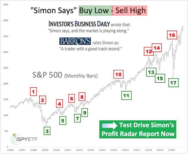
Barron's rates iSPYETF as "trader with a good track record" and Investor's Business Daily says: "When Simon says, the market listens." Find out why Barron's and IBD endorse Simon Maierhofer's Profit Radar Report
Turning individual studies into a forward-looking Risk/Reward Heat Map is a 2-step process:
1) Develop each individual study. Here is how it’s done:
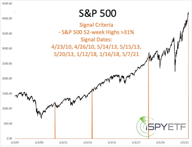
- Identify a unique market development. Example: Last Friday, the S&P 500 and 32% of its component stocks closed at a 52-week (or all-time) high.
- Identify past precedents that meet the same (or similar) criteria. Example: Since 2000, the S&P 500 and >31% of its component stocks closed at 52-week high 7 other times (total of 8 signal dates). The orange line in the chart below highlight all the signal dates.
2) Turn individual study into a forward-looking component of the Risk/Reward Heat Map. Here is how it’s done:
- Calculate the S&P 500 returns and odds of positive returns for 1, 2, 3, 6, 9, 12 months after past precedents (signal dates). Example: After the above-mentioned signal dates, the S&P 500 was down 1 month later 6 times (86%) with an average loss of 2.2% (using only 1st signal in 30 days). 12 month later, the S&P 500 was up 5 times (71%) with an average gain of 10.5%.
- When the odds of positive returns are 80% or higher for a certain month, it is counted as bullish study for that month (+1 is added for that month).
- When the odds of positive returns are 50% or lower for a certain month, it is counted as bearish study for that month (-1 is added for that month). Example: The above study is bearish for June.
The proof is in the pudding
Shown below is one of many bullish studies published in April 2020 (others are available for review here). Explanatory annotations are made in yellow.
The unique development at the time was that the S&P 500 delivered two 90% up volume days (when 90% of volume flowing into advancing stocks) in a 3-day period.
2 out of 3 90% up days happened 7 other times in the past. The colored graphs show returns after the 7 prior signal dates.
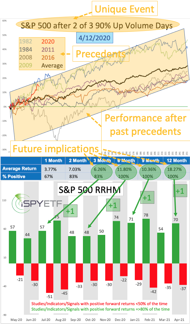
The performance tracker (table at bottom of chart) shows that returns for the next 3, 6, 9, 12 month were wildly bullish with 83% - 100% odds of positive returns. +1 (bullish odds) were added for the months of July 2020, October 2020, January 2021, April 2021.
Repeating the above process of identifying a unique event and its precedents and then cataloguing forward returns 613 times results in the up-to-date Risk/Reward Heat Map.
Does the Risk/Reward Heat Map work?
The chart below plots the S&P 500 against net signals (bullish - bearish) since inception, which allows us to visually assess if the Risk/Reward Heat Map works.
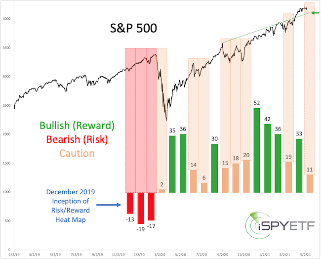
The outright bearish implications for January/February/March 2020 (red columns) were echoed by the stock market during the February/March 2020 meltdown.
Starting in March 2020, the vast majority of studies implied significant future reward with little risk (green columns).
Throughout 2020 and 2021 there were only a few periods of weakness, and all of them occurred when the number of bullish studies was less than 20 (orange bars).
Sell in May and go away?
For May, the Risk/Reward Heat Map is in caution mode, and the May 3 Profit Radar Report warned that: "May continues to be a pressure point, resistance in terms of time."
The Risk/Reward Heat Map is unique because it's actually a predictive forward looking tool. To filter out false signal, I use real time data to validate the Heat Map's message. Right now, it will take a good close below 4,090 to unlock a deeper pullback.
The Risk/Reward Heat Map is constantly updated and shows riks/reward for each of the next 12 months. The Risk/Reward Heat Map is available to subscribers of the Profit Radar Report.
Simon Maierhofer is the founder of iSPYETF and the publisher of the Profit Radar Report. Barron's rated iSPYETF as a "trader with a good track record" (click here for Barron's evaluation of the Profit Radar Report). The Profit Radar Report presents complex market analysis (S&P 500, Dow Jones, gold, silver, euro and bonds) in an easy format. Technical analysis, sentiment indicators, seasonal patterns and common sense are all wrapped up into two or more easy-to-read weekly updates.
|