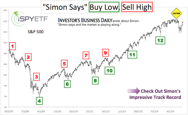
A few months ago, we found striking similarities between the 2015 S&P 500 chart and the 2011 and 2007 charts.
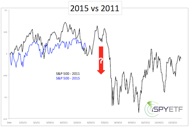
The 2011 analogy alerted us of a steep summer selloff followed by a choppy rally. Below is the 2011 comparison, first published on June 15:
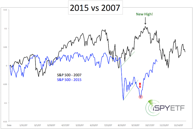
The 2007 analogy suggested a recovery to new highs.
The initial comparison between 2015 and 2011 is available here: S&P 500: 2011 vs 2015
The initial comparison between 2015 and 2007 is available here: S&P 500: 2007 vs 2015
The 2011 ‘script’ (that’s what we called it, because it was so accurate) projected a break or test of the August S&P panic low (1,867), followed by a rally.
The 2007 analogy suggested a rally to new all-time highs.
The September 20 Profit Radar Report analyzed and compared both prior pre-election years (2007 and 2011) to 2015 and came up with the following conclusion: “Regardless [of whether 2007 or 2011 plays out], the S&P should come back up to test 2,040 (and likely higher) before the year is over.”
If you enjoy quality, hand-crafted research, >> Sign up for the FREE iSPYETF Newsletter
In other words, it doesn’t really matter - with or without new low - the S&P 500 will rally. That’s exactly what happened.
Below are updated 2015 vs 2011 and 2015 vs 2007 charts, along with a bonus chart that shows why a 2007-like topping pattern is becoming more likely.
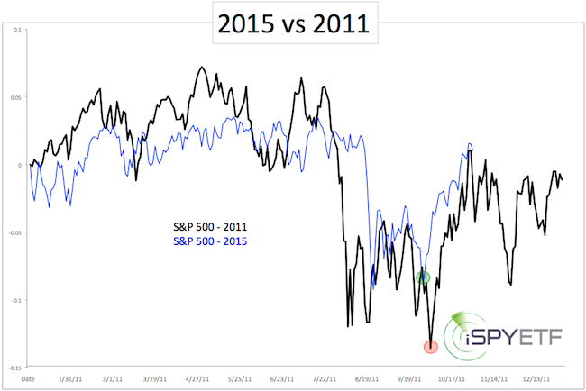
Following the initial August panic low, the S&P 500 decided to follow a hybrid template, as performance took ‘pages taken’ from the 2007 and 2011 books.
What’s Next?
In 2007 and 2011 the S&P digested gains in November, which is in harmony with general pre-election year seasonality.
Perhaps more important (think about the elephant in the room) is the fact that buying power is drying up, as it did in 2007.
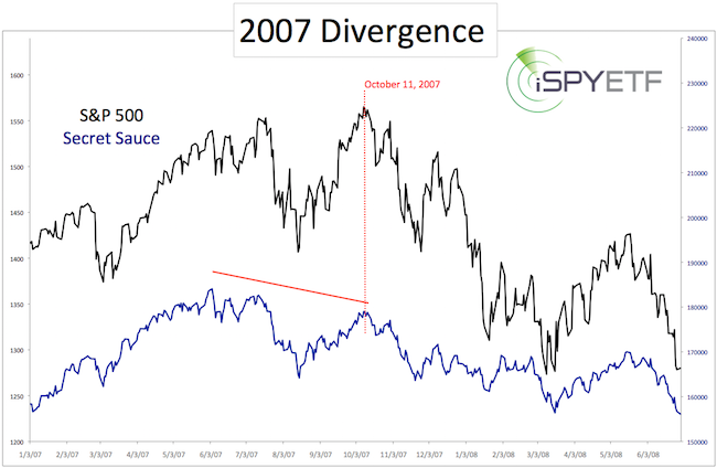
The bonus chart above shows the subtle decline in buying power (as measured by my proprietary indicator called ‘secret sauce’ – click here for more details).
This kind of divergence, present now, also preceded the 2007, 2000 and 1987 market tops.
Based on buying power, a 2007-like outcome, where new highs are meet with a wave of selling, is becoming more likely.
For continued updates on what this bearish divergence means and out of the box S&P 500, gold and silver anaylsis, join the Profit Radar Report.
Simon Maierhofer is the publisher of the Profit Radar Report. The Profit Radar Report presents complex market analysis (S&P 500, Dow Jones, gold, silver, euro and bonds) in an easy format. Technical analysis, sentiment indicators, seasonal patterns and common sense are all wrapped up into two or more easy-to-read weekly updates. All Profit Radar Report recommendations resulted in a 59.51% net gain in 2013 and 17.59% in 2014.
Follow Simon on Twitter @ iSPYETF or sign up for the FREE iSPYETF Newsletter to get actionable ETF trade ideas delivered for free.
If you enjoy quality, hand-crafted research, >> Sign up for the FREE iSPYETF Newsletter
|