Some define technical analysis as mumbo jumbo, others (and that’s the official definition) see it as a method of forecasting prices based on past market activity.
Isn’t using past market activity (or prices) to forecast future prices like driving by looking in the rearview mirror? That’s a great question.
The Past Matters
Why does the past matter? Allow me to use a tennis analogy. Roger Federer (possibly the best ever all-around tennis player) has never won a clay court match against Rafael Nadal (possibly the best ever clay court tennis player) at the French Open Tournament (one of the big four Grand Slam tournaments).
Who do you think has a mental advantage the next time Federer and Nadal meet at the French Open? Federer knows he’s never beaten Nadal at the French Open, Nadal knows he’s never lost to Federer at the French Open.
Federer has to overcome a mental ‘resistance’ to beat Nadal at the French Open. I use the term mental ‘resistance’ because it relates to resistance (and/or support) seen in the securities market.
Charts of specific securities, such as the S&P 500, reflect the mental state of the composite of all investors. Charts reveal past price areas where either sellers or buyers prevailed, creating areas of support or resistance.
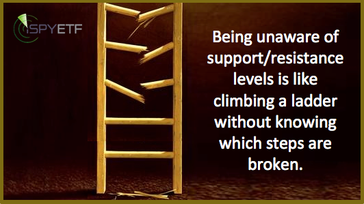
Being unaware of previously established support/resistance levels is like climbing a ladder without knowing which steps are broken.
Past Significance of Support/Resistance Levels
The proof is in the pudding, so let’s take a look at a 14-year chart of the S&P 500 Index (corresponding ETF: SPDR S&P 500 ETF – SPY).
The chart includes four long-term support/resistance levels made up of two trend lines (red lines) and two parallel channels (black and dashed lines).
The trend channels are created by connecting the 2002 and 2009 lows with the 2000 high (dashed black line) and 2007 high (solid black line). Since the last touch point of this channel is the 2009 low, it could be used as a guide only thereafter.
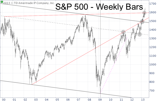
2000 High Parallel Channel
In May 2011, the S&P approached the upper dashed parallel channel resistance (gray circle). I remember that time vividly as my wife and I were vacationing on a little island in the Bahamas (for some reason the market usually sells off when I’m on vacation).
My May 1, 2011 update for subscribers featured the chart below and stated: “The chart below updates the S&P's position relative to various resistance levels and the ideal target range for a potentially historic market top. The ideal target range is between 1,369 and 1,382.”
The next day (May 2, 2011) the S&P briefly spiked as high as 1,370.58 (right into the 1,369 – 1,382 target range) on news that Osama Bin Laden had been killed. The stock market euphoria was short-lived, as the S&P sold off, fell below trend line support (pink line) and ultimately plunged as much as 20%.
The S&P 500 paid attention to this parallel channel once more in November 2011, when it was used as a springboard for the most powerful leg of the post-2009 QE bull market.
2007 High Parallel Channel
In January 2013 the S&P 500 approached the ‘big brother version’ of the same parallel channel (this time the upper line was created by the 2007 not the 2000 high – gray circle).
The parallel channel resistance coincided with trend line resistance (red line). This was powerful resistance and I thought stocks would pause and temporarily reverse there … but they didn’t.
With that resistance out of the way, it was clear that the S&P wanted to test its all-time high and the next trend line resistance (red line) around 1,593.
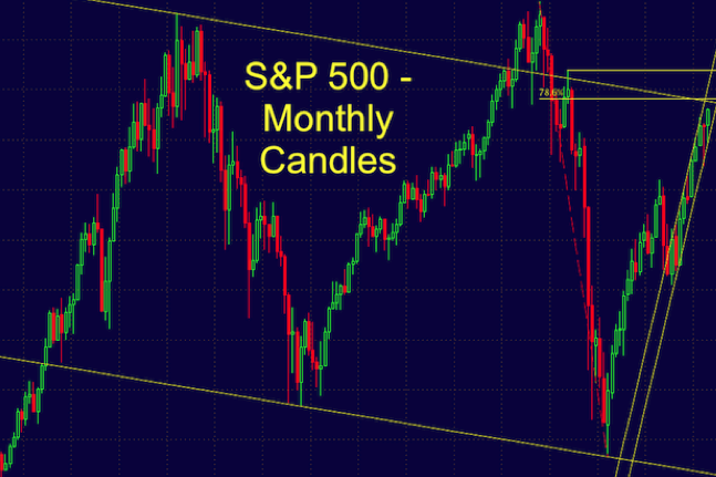
It barely shows on the weekly bar chart, but the S&P was actually repelled by trend line resistance at 1,593 in April (subscribers of the Profit Radar Report went short at 1,593 and closed out short positions at 1,540).
This (temporary) decline from 1,593 to 1,536 left several open chart gaps (one at 1,588), that’s why we expected a deep retracement. That deep retracement however, turned into a rally to even higher highs.
With the S&P above the last trend line resistance and with no other overhead resistance levels caused by prior support/resistance levels left (the S&P carries no more ‘inherited technical burdens’), there is nothing holding stocks back.
That doesn’t mean stocks can’t and won’t decline, but as long as prices remain above trend line support, the larger trend is simply up.
Unlike the S&P 500 and Dow Jones (which are trading at all-time highs), the Nasdaq-100 still trades well below its heyday highs of the year 2000. This means there are more well-defined support and resistance levels available.
Those support/resistance levels are powerful risk management tools and can be used to find low-risk entries and high probability trade set ups.
At the time of this article's publication, the Profit Radar Report is long the Nasdaq-100 with a stop-loss just beneath an important long-term support.
The Profit Radar Report reveals key support/resistance levels along with low-risk and/or high probability trade set ups.
|