Have you ever attended a seminar where the teacher said: ‘if you only remember one thing, remember this.”
If you only know one thing about this QE bull market (in my humble opinion), let it be this: Persistence wears down resistance.
Before I explain what this means, let me insert this disclaimer:
I do not agree with the Fed’s easy money policy. It is not right, it is not fair, and it shouldn’t be legal, but my job as a market forecaster is to make money for my subscribers. If rising stocks translate into gains for my Profit Radar Report subscribers, so be it.
What I’m about to share with you has kept us on the right side of the trade (being long), even though I’ve gone on record saying that the odds of a significant market top around current prices are higher than 50%.
I also want to admit that my September 10 article on the equity put/call ratio showed a bearish extreme, which was supposed to lead to lower prices. Well, it didn’t, but QE bull trading patterns prevented us from going short at a time when (as we know now) stocks were getting ready to soar.
On the flip side (and unrelated to the QE bull trade pattern), I would be remiss not to mention that the August 7 Profit Radar Report saw higher prices coming:
“We continue to expect higher prices, since the important resistance level of 1,730 for the S&P 500 (SNP: ^GSPC) hasn’t been touched yet.” We actually went long the S&P 500 ETF (NYSEArca: SPY) when the S&P 500 moved above resistance on August 29 (buy trigger was at 1,642).
Ok, with that out of the way, let’s talk about the QE bull pattern.
Persistence Wears Down Resistance – The Pattern
Persistence wears down resistance basically means that sideways trading almost always leads to higher prices. Corrections originate from intraday reversals or gap down opens, but almost never develop straight out of range bound trading.
The green boxes in the S&P 500 (NYSEArca: VOO) chart below highlight times when range bound trading (usually 3 – 6 days) was followed by a spike higher (the red box marks an exception to the rule).
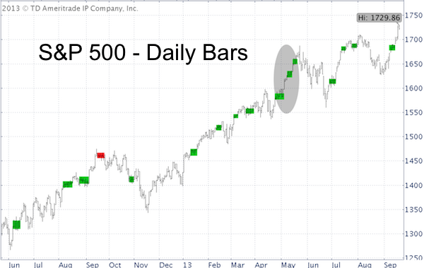
The spikes are often caused by gap up opens. The biggest chunk of the gains happen within the first minute of trade, which tends to bypass investors waiting on the sidelines. Today’s bypassed investor is tomorrow’s buyer.
Quite frequently we see the pattern highlighted via the gray oval. Consolidation - spike – consolidation – spike – consolidation – spike.
Only a coiled up snake can strike. Like a snake, the stock market (NYSEArca: VTI) coils up and strikes, and coils up and so on. The opposite is true of the VIX (Chicago Options: VXX), which has been taking a nap for most of the year, allowing investors to snooze in complacent bliss.
The night before this week’s Fed spike, the Profit Radar Report (September 17 issue) referred to this pattern once again and wrote: “A range bound market rarely precedes a top. Tuesday’s lackluster sideways session suggests at least another spike.”
When Will the Pattern Break?
Obviously QE is at the root of this pattern, and it’s commonly believed that the amount of dispensed QE (taper or no taper?) will eventually break the pattern.
This may well be, but there is another - so far unnoticed - force that can break the QE bull pattern.
This force is discussed here: Who or What Can Kill this QE Bull Market?
Hint: It’s up to investors themselves.
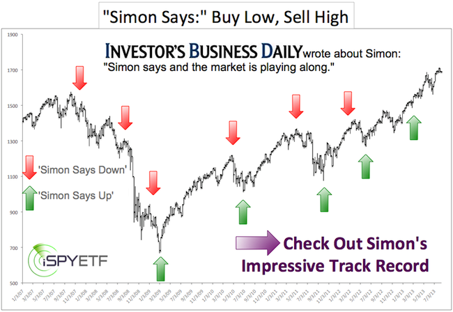
Simon Maierhofer is the publisher of the Profit Radar Report.
Follow Simon on Twitter @ iSPYETF or sign up for the FREE Newsletter.
|