AAPL has had a wild ride. In a matter of months the stock lost 45% after a 15-year Apple specific bull market.
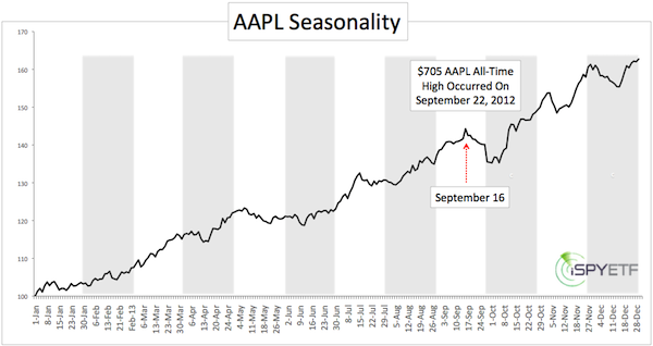
Apple shares recorded their all-time top tick on Friday, September 21, 2012 at 705.07.
Friday, September 21 may seem like an arbitrary day for an all-time high, especially since September/October usually marks the onset of a seasonally strong period for stocks.
However, September 21 makes a lot of sense if you are familiar with AAPL seasonality. How come?
The seasonal chart for AAPL reveals that – on average - AAPL suffers its biggest losses of the year starting on September 16.
AAPL seasonality is based on price action since 1998, when Steve Jobs U-turned Apple from near bankruptcy to profitability.
AAPL seasonality was one of the reasons the Profit Radar Report turned bearish on Apple and issued this, at the time, shocking recommendation:
“Aggressive investors may short Apple (or buy puts or sell calls) above 700 or with a close below 660.” The move above 700 occurred first and turned this into one of the sweetest short trades in history.
It's always handy to be aware of AAPL seasonality. Despite its historic meltdown, Apple remains the ‘alpha male’ among stocks.
Depending on its share price, it accounts for more than 10% (at one time over 20%) of the Nasdaq-100 (Nasdaq: ^IXIC) and Technology Select Sector SPDR ETF (NYSEArca: XLK). It continues to be the top holding of the S&P 500 Index (SNP: ^GSPC) and SPDR S&P 500 ETF (NYSEArca: SPY).
How about seasonality for the broader stock market?
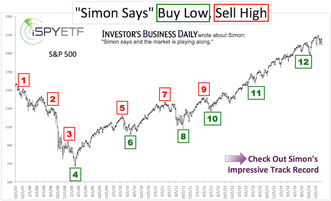
The Profit Radar Report has charted seasonal forces for the S&P 500 going all the way back to 1950 and condensed them into one telling chart.
This chart alerted us of the April 2010 and May 2011 highs, which were followed by 10 – 20% declines and the October 2011 and June 2012 lows, which were followed by a relentless rally (up 58% so far).
The Profit Radar Report not only charts basic seasonality, it also looks at (and illustrates) post election year seasonality and post-election year seasonality when a democratic president is at the helm.
Simon Maierhofer is the publisher of the Profit Radar Report. The Profit Radar Report presents complex market analysis (S&P 500, Dow Jones, gold, silver, euro and bonds) in an easy format. Technical analysis, sentiment indicators, seasonal patterns and common sense are all wrapped up into two or more easy-to-read weekly updates. All Profit Radar Report recommendations resulted in a 59.51% net gain in 2013 and 17.59% in 2014.
Follow Simon on Twitter @ iSPYETF or sign up for the FREE iSPYETF Newsletter to get actionable ETF trade ideas delivered for free.
If you enjoy quality, hand-crafted research, >> Sign up for the FREE iSPYETF Newsletter
|