
The full year S&P 500 forecast is my biggest project of the year, and quite frankly it’s kind of a thankless job. Why? It gives every critic a documented, black and white foundation for criticism.
It is impossible to predict a full year of stock market future, that's why market forecasts are loaded with ‘ifs,’ “buts,’ and other ambiguities. Anyone attempting to predict the unpredictable is bound to miss the mark.
That’s why no other newsletter (at least none that I’m aware of) publishes an actual full year S&P 500 chart projection. Accountability is an under appreciated (if not entirely ignored) concept on Wall Street. But what’s the purpose of following many time-tested indicators if we don’t put them to work?
As subscriber, you deserve a straight-forward forecast. My goal is to provide a rough roadmap for the year ahead based on what indicators are telling us right now (updates will be added at the bottom of this forecast as more information becomes available).
Sincerely,
Simon Maierhofer
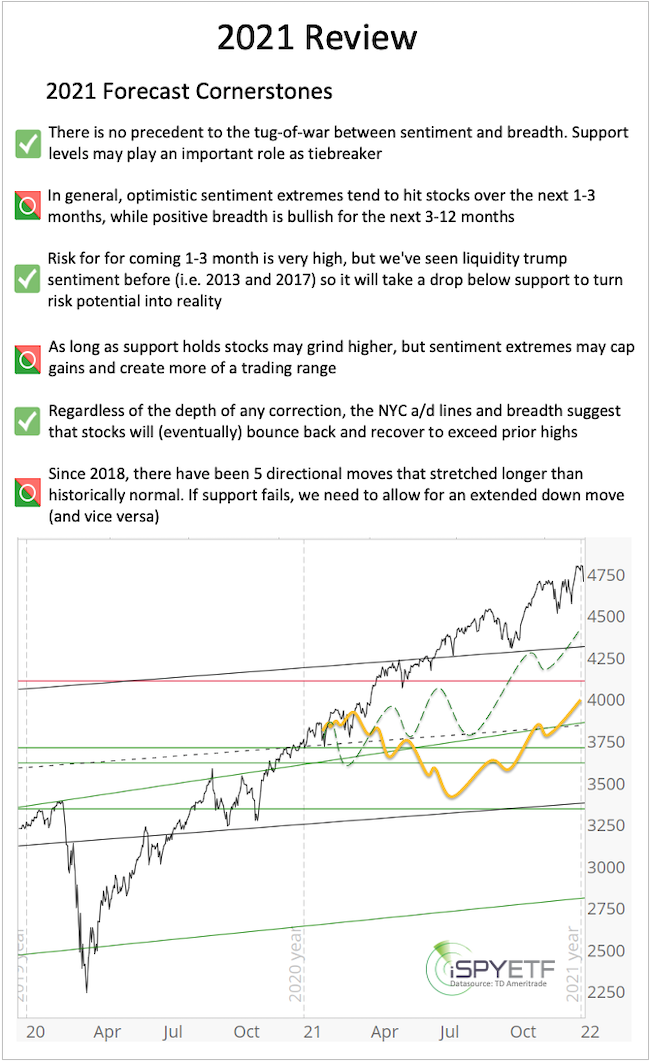
2021 Review
The tug-of-war between extremely bullish sentiment (bearish for stocks) and positive breadth (bullish for stocks) was in full force at the same time last year. There was no precedent for a collision of opposing forces of such magnitude.
In general, sentiment extremes tend to hit stocks over the next 1-3 months, while positive breadth is bullish for the next 3-12 months.
Based on the S&P 500, the early 2020 euphoria didn’t affects stocks, but breadth continued to propel price the entire year.
Based on Nasdaq-traded stocks, however, the picture looks different. Many Nasdaq-traded stocks peaked early 2021, and 38% of those stocks have lost more than 50% since (look at a chart of the ARKK ETF, which includes some of the more aggressive names in the tech sector). Never before have so many stocks dropped so much while the broader Nasdaq Composite is so close to its all-time high.
The key takeaway from the 2021 S&P 500 Forecast that: “As long as support holds stocks may grind higher,” turned out to be much more spot on than we could have anticipated. Although we were looking for new all-time highs in 2021, pullbacks were more shallow and rallies more resistant to pullbacks than expected.
Below are the cornerstones of the 2021 S&P 500 Forecast and how they matched up against reality:
S&P 2022 Forecast
The 2022 S&P 500 Forecast is based on the "4 Engines of Market Forecasting" and the Risk/Reward Heat Map (RRHM).
-
Supply & Demand
-
Technical Analysis
-
Investor Sentiment
-
Seasonality & Cycles
-
Risk/Reward Heat Map (derived of above components)
Supply & Demand, Breadth
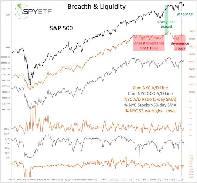
Cumulative NY Composite Advance/Decline Lines
Our simple and straight-forward use of the cumulative NY Composite advance/decline line (NYC a/d line) has kept us on the right side of the market (long-term bullish) for the past decade.
The “How to Discern a Major Market Top” report explains the NYC and NYC OCO a/d lines and how we’ve successfully used them.
Although big divergences preceded a number of bear markets (1987, 2000, 2007), the study published in the August 17, 2021 PRR, showed that - since 2007 - not many divergences led to deeper corrections. The August 17, 2021 study was one reason why we didn’t turn bearish back in August/September. As suggested by the study, the S&P continued higher and the divergence was erased on October 20, 2021.
Since then, the bearish divergence reappeared again at the January 2022 S&P 500 highs. This internal market deterioration is a concern and a warning sign.
Other Breadth Metrics
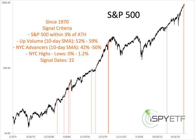
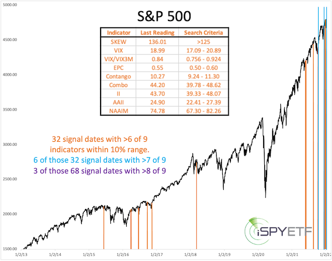
For more context, here is a look at other breadth measures and how the market reacted to similar constellations in the past.
The chart below highlights other times when advancing stocks, volume of advancing stocks, new highs minus lows were in a very similar range (see chart insert for exact criteria) while the S&P 500 traded within 3% of an all-time high.
Highlighted next are other times when the percentage of stocks above their 50-and 200-day SMAs were in a very similar range (see chart insert for exact criteria) while the S&P 500 traded within 3% of an all-time high (data history only goes back to 2002).
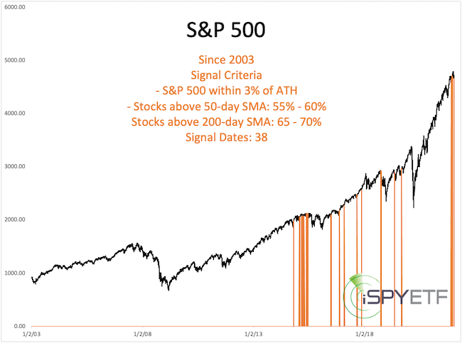
Immediate and persistent selloffs after similar constellations were the exception, not the norm.
A Divided Market
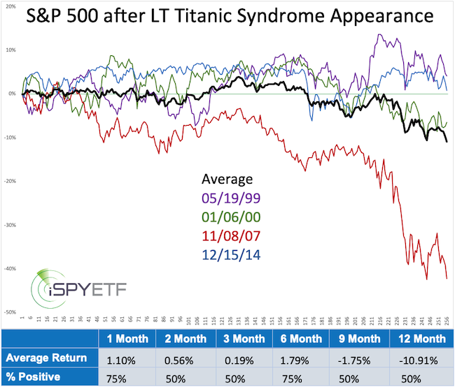
Since August, the market delivered 3 quick selloffs and 2 even quicker rallies. This resulted in some positive and some negative breadth studies and an unusually high number of new 52-week highs and lows. This condition triggered a cluster of so-called Hindenburg and Titanic signals.
The chart below highlights other times when the 6-month average of Titanic signals exceeded 25. It's been a good bear market indicator.
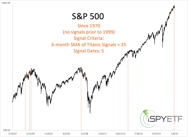
Forward returns following prior signals (shown are forward returns after the first signal in 6 months) were weak. This study is included in the Risk/Reward Heat Map discussed below. Although the majority of breadth studies are positive, this is one that should not be ignored.
Technical Analysis
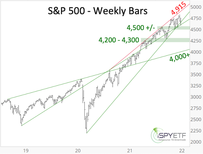
Support/Resistance Levels
Below are some support/resistance levels we'll be watching.
Resistance: Trend line resistance is around 4,915. We do not expect the S&P to break above this trend line in 2022.
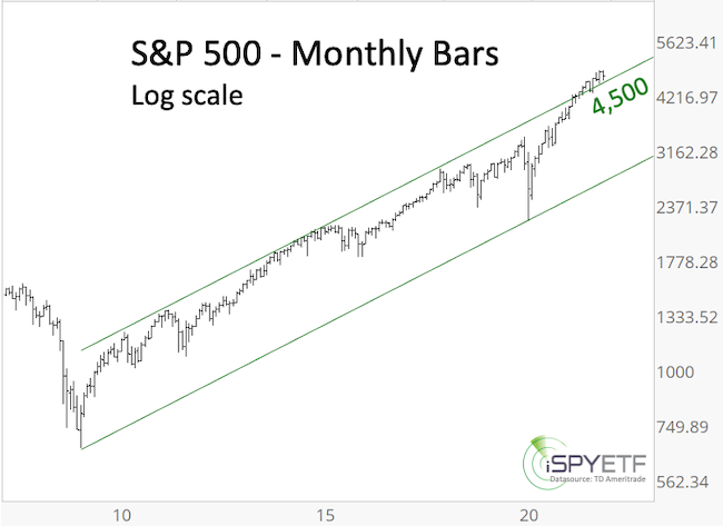
Support: Short-term, the January 10, 2022 low at 4,582 is important. Failure to hold above this level would be a warning signal with the potential for a quick drop into the 4,200 - 4,300 range. Long-term trend channel support around 4,500 (monthly log scale chart) is also worth watching.
If the 4,200 - 4,300 support zone fails, a test of the 4,000 zone (as low as 3,700) is possible.
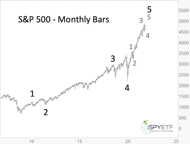
Elliott Wave Theory
The basics of Elliott Wave Theory (EWT) are explained here.
The most likely EWT-based option (scenario #1) highlighted in the 2021 S&P 500 Forecast projected higher prices with 4,500+ as potential target. 4,500 was matched and exceeded easily. Below is an updated wave count for this scenario.
Scenario #1: Based on this scenario, up side is limited and a deeper correction or bear market is near or has already started.
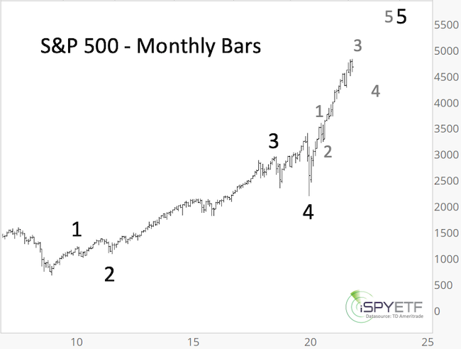
Scenario #2: This is essentially the same wave count as scenario #1 with the difference that a choppy correction (gray wave 4, perhaps after another all-time high) followed by wave 5 rally towards and above 5,000 is still ahead.
Scenario #3: Based on this scenario the S&P 500 has carved out a number of a-b-c sequences at various degrees. The rally from the March 2020 low would be a massive wave B with a sharp wave C ahead.
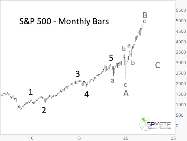
As mentioned previously, the rally from the March 2020 low is sloppy and can be interpreted in various ways. Although the scenarios are labled #1, #2, #3, this year it does not mean that scenario #1 is more likely to play out than scenario #3. Instead, we’ll focus on the commonality of all 3 scenarios: Up side is limited and down side risk is increasing.
Investor Sentiment
Investor sentiment reached a level of euphoria in Q1 2021. Many of the hottest, ‘must own’ stocks peaked around that time (i.e. the ARK Innovation ETF - ARKK), but the major indexes continued higher while sentiment cooled off.
From there on we realized that liquidity trumps sentiment and more upside was likely. Minor extremes of pessimism did mark minor lows, which is something we’ll watch out for in 2022. Based on the overall picture, we expect to see more indicators reflecting a higher degree of pessimism in 2022 than 2021.
Most of the 9 sentiment gauges shown below are in neutral territory, with no real extremes.
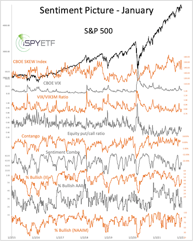
A new feature of the Sentiment Picture (published monthly here) was introduced in June. The new feature highlights other times where sentiment readings were most similar to current readings (a detailed explanation of this new feature along with the individual sentiment indicators is available here).
As the chart below shows, similar sentiment readings in the past were generally followed by higher prices, but 3 instances eventually led to pullbacks of 5% - 20%.
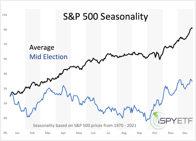
Seasonality & Cycles
The chart below shows S&P 500 seasonality for the average year and for mid election years.
2022 is the mid election year, which is the weakest of the 4-year presidential election year cycle. Historically (going back to 1950), the S&P 500 declines on average about 20% into the mid-term election year low.
The following year (the pre election year, 2023) is the strongest year of the election year cycle as incumbent presidents prime the pump to increase the odds of reelection. Historically, the S&P 500 gains on average about 50% from the mid election year low to the pre election year high.
Cycles project a fair amount of political and economic turmoil starting in Q1 of 2022. Based on seasonality and cycles, 2022 will be a tough year to navigate where high stocks prices early in the year should be used to raise cash for a better buying opportunity later in the year.
All available seasonality charts can be viewed here.
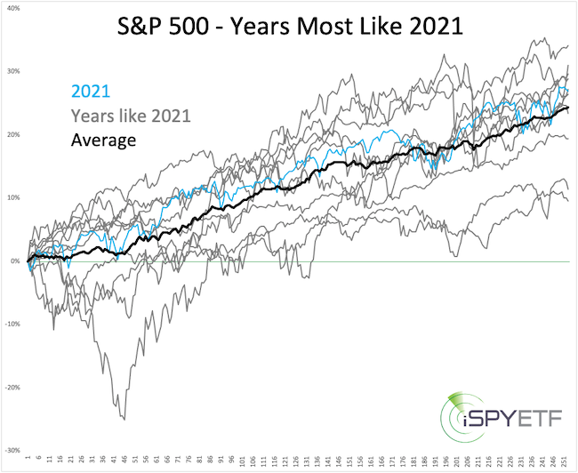
Years like 2021 and Following Performance
For the past decade, the Profit Radar Report has repeatedly emphasized that momentum does not die easily. Stocks entered 2021 with a ton of momentum and it continued to propel prices. How long can up side momentum last?
Graphed below are the years with S&P 500 price action most similar to 2021.
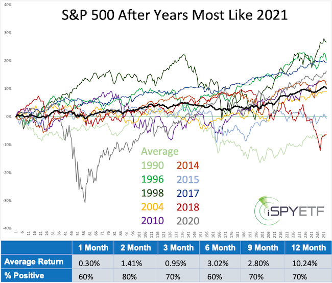
Shown next is the S&P 500 forward performance following those years. Based on the average performance (bold black graph) and the performance tracker (table at bottom of chart) momentum didn’t die, but it paused. Average performance for the first nine months was positive but very subdued with most of the gains coming in the fourth quarter.
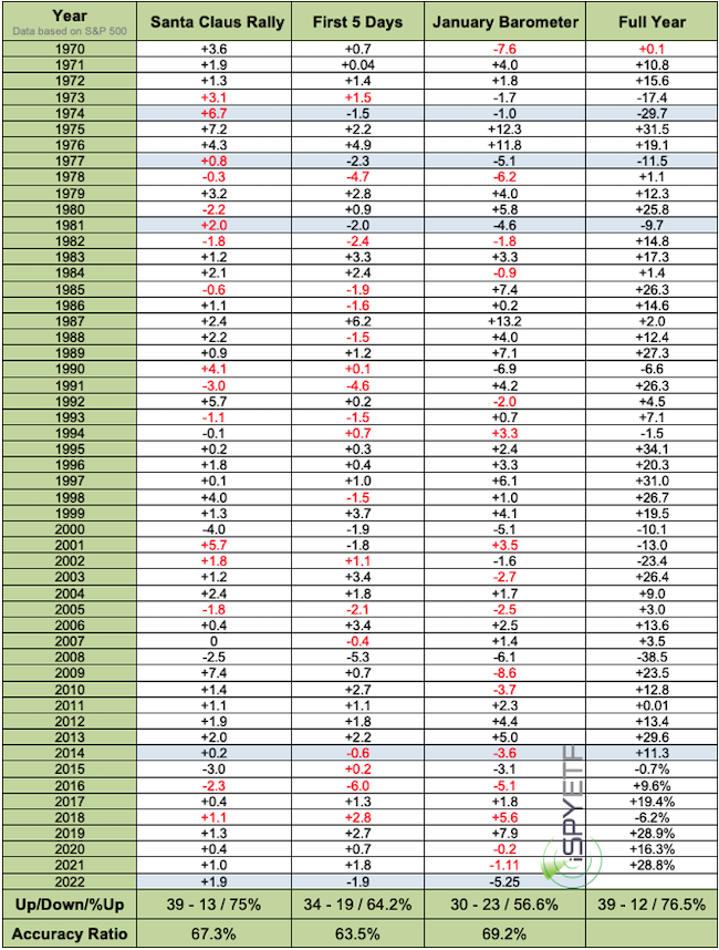
S&P 500 Barometers
The Santa Claus Rally (SCR) delivered a 1.9% gain, but the First 5 Days of January (F5J) a 1.9% loss, the January Barometer (JB) will be updated once January is in the books. A detailed explanation of the year ahead barometers is available here.
The table below shows all SCR, F5J, JB and full year returns since 1970. Red numbers highlight a failed barometer).
Since 1970, the same constellation (SCR up, F5J down) occurred 8 other times (shaded in blue). The S&P 500 finished the year with a loss 4 times (average 15.98%) and with a gain 4 times (average 16.25%), not a predictive constellation.
Update (2/6/2022):
The S&P 500 ended January with a 5.25% loss. Since 1950, January ended in the red 22 other times, with 9 of them (39.1%) showing year-end losses. There were 4 other times when the Santa Claus Rally (SCR) was positive, the First 5 Days of January (F5J) negative, and the January Barometer (JB) negative (highlighted in blue). 3 of those 4 times finished with year-end losses. This information has been added to the 2022 S&P 500 Forecast.
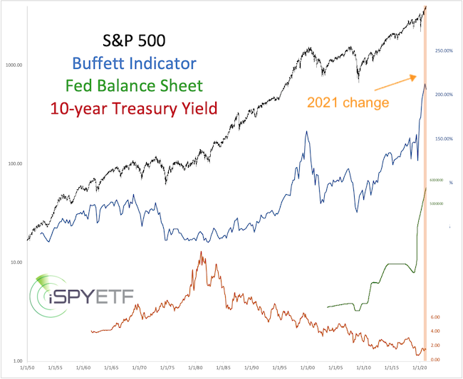
Valuations
The 2021 S&P 500 Forecast was the first one to comment on valuations. Why? Because many analysts warned that sky-high valuations will cause a crash. The Profit Radar Report didn’t disagree with sky-high valuations, but outlined 3 reasons why a crash was unlikely.
Below is an updated version of the chart featured last year. Since then, the S&P 500 gained 26% and the Buffett Indicator rose 18%. However, as stocks became more overvalued, the Fed’s balance sheet also increased by 17% and 10-year Treasury yields dropped another 20%.
As anticipated, Fed liquidity and the low interest environment more than neutralized the threat posed by valuations. Since the Fed is planning to unwind and reduce purchases (and shrink its balance sheet) in 2022, the risk of a more serious correction this year is much greater than in 2021.
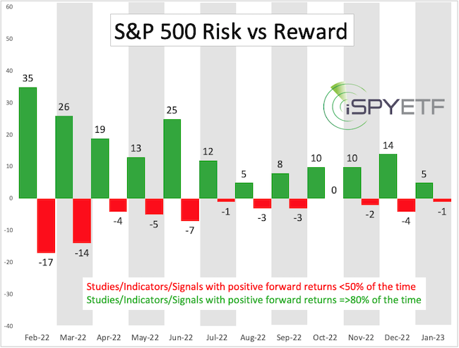
Risk/Reward Heat Map (RRHM)
The Risk/Reward Heat Map (RRHM) was introduced December 2019 (December 11, 2019 PRR) and correctly foreshadowed increased risk for January/Februay/March 2020 and high reward thereafter.
A detailed introduction to the Risk/Reward Heat Map (RRHM) is available here.
Due to the positive price action and bullish breadth readings ever since the March 2020 low, the RRHM has a bullish bias for 2022.
Shown below are the bullish and bearish ‘pressure points’ projected by the indicators, studies, signals (ISSs) analyzed (775 since inception).
Shown next is the net (risk - reward), which is bullish.
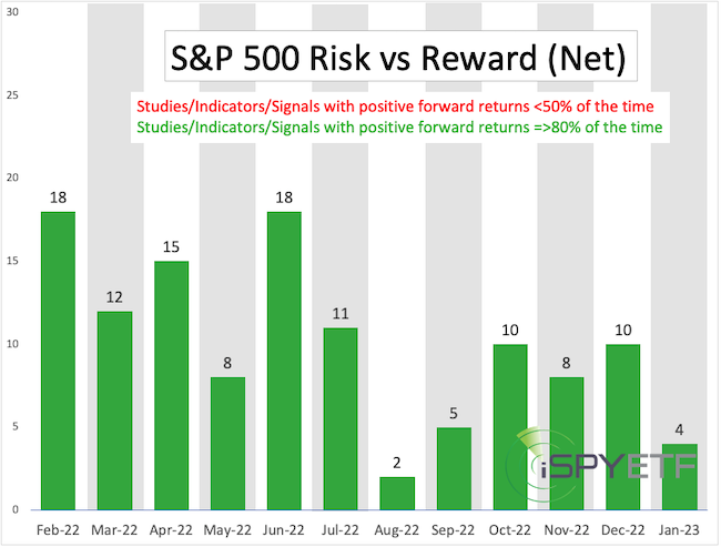
The chart below plots the net readings of the RRHM (since inception) against the S&P 500.
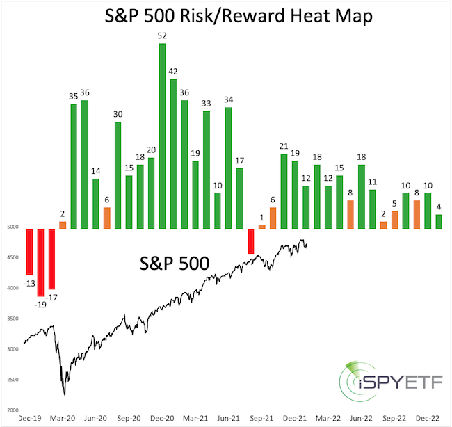
The message of RRHM for 2022 is a generally positive one. Currently, there's a measure of weakness projected around summer time.
It is, however, possible that any upcoming selloff will trigger a number of studies with bearish future implications (like during the September and November 2021 dips), which may somewhat alter the projection.
Summary
Here are the key takeaways from the indicators discussed above:
-
2022 should see an increase of volatility (and potentially turmoil), ideally starting later in Q1, but may have already started.
-
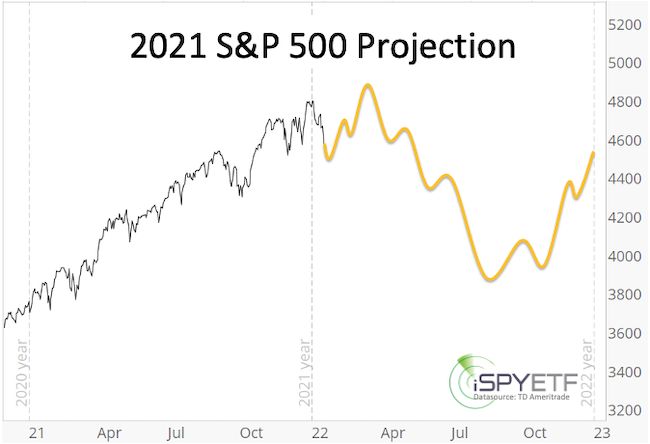
S&P 500 up side for Q1, Q2 seems limited to 4,900 - 5,000. If attained, this would be an opportunity to raise cash.
-
2022 should see the first 10%+ correction since 2020 with 3,700 - 4,000 as potential target to be reached sometime around summer.
-
Risk of an even deeper decline exists, but RRHM and mid election year pattern suggests a recovery and rising prices for Q4.
-
In short, a S&P 500 rally towards 4,900 would be used to raise cash and a drop towards (and perhaps below) 4,000 would be a time to put cash to work.
2022 S&P 500 Projection
Continued updates are published in the Profit Radar Report section.
|