Subscribers to iSPYETF’s free e-mail newsletter receive a market outlook, usually once a week. The market outlook below was sent out on May 6. If you’d like to sign up for the free e-newsletter, you may do so here (we will never share your e-mail with anyone, just as we don't accept advertising).
Let's face it, S&P 500 performance has been strong but ugly ... and downright boring to watch. Despite the yawn environment, I just discovered a historic pattern that played out 90% of the time (see below).
Yes, while markets are grinding I'm running dozens of screens to gain an edge for the next move.
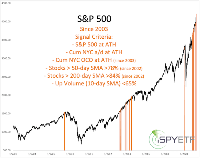
For example, the last S&P 500 all-time high (last Thursday) also saw:
- Cumulative NY Composite a/d lines at all-time highs
- 88% of S&P 500 stocks above their 50-day SMA
- 95% of S&P 500 stocks above their 200-day SMA
- Only 58% of volume flowing in advancing stocks (10-day SMA)
Running a screen based on the above parameters yields no hits, which means it never happened before.
We can't learn much from a sample size of 1, but lowering the threshold gives as more precedents to work with.
The yellow lines highlight when less restrictive criteria (see chart) were met. Unfortunately the sample size couldn't be more conflicting (don't shoot the messenger). We have some signals right before the 2007 and 2020 crash and others during the 2013 and 2020 melt-up.
Let's take a different approach. Instead of scanning for similar past occurrences based on breadth we'll look at performance.
Here is our baseline:
-
From January - April 2021, the S&P 500 was up 11.32%
-
In 2020 (prior year), the S&P 500 recorded a 16.26% gain
-
2021 was a post election year
Going back to 1970, we now identify the following:
- Years S&P 500 was up more than 10% on April 30
It happened 14 other years
- Years S&P 500 gained 16% +/-5% the year before
It happened 5 other years
- Years that were a post election year (like 2021)
It happened 1 other year
- Years with a similar chart trajectory (correlation)
Based on the above criteria, the gray graphs reflect the January - April performance of the 10 years most similar to 2021 (in red).
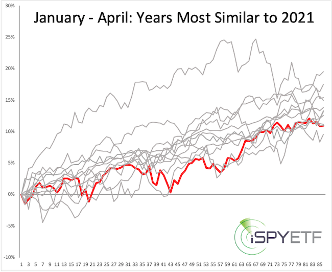
The logical next step is to chart the forward performance of the 10 most similar years, which is exactly what I did. After doing that, I look for common themes.
This study revealed an interesting commonality: 3 month later (which corresponds to August 1), the S&P 500 had the same directional bias 90% of the time. The full study was published in yesterday's Profit Radar Report.
Even dull markets can offer clues about future performance ... if you look hard enough ... or have someone who does the searching for you.
Continued updates, out-of-the box analysis and forward performance based on historic precedents are available via the Profit Radar Report.
Barron's rates iSPYETF a "trader with a good track record," and Investor's Business Daily writes "Simon says and the market is playing along."
|