Subscribers to iSPYETF’s free e-mail newsletter receive a market outlook, usually once a week. The market outlook below was sent out on June 10. If you’d like to sign up for the free e-newsletter, you may do so here (we will never share your e-mail with anyone, just as we don't accept advertising).
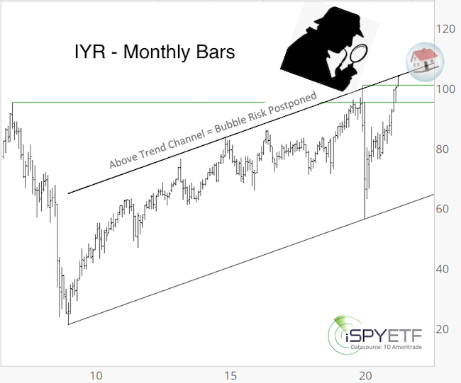
If you own a home, want to buy a home or live anywhere but under a rock, you've felt or heard about skyrocketing real estate prices.
Is there a real estate bubble, and what's the risk of it bursting?
Here is one simply chart to gauge the real estate bubble risk ... and incidentally, this short article also explains why the S&P 500 has been stuck around 4,200.
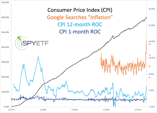
Ironically, COVID-19 accomplished what the Federal Reserve has tried for over a decade and failed: Inflation.
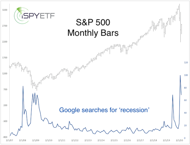
In May, more people than ever googled 'inflation' (orange graph, second chart). Often this kind of interest in a topic occurs towards the end of a trend.
For example, in the April 8, 2020 Profit Radar Report, I published google searches for 'recession' (chart below) to make the argument that the recession is over.
This contrarian take worked great for the recession, but does not work like that for inflation. Here's why:
Most trends exhaust themselves when they become too popular (popular usually means there are no more buyers left, i.e. Bitcoin in April).
However, when inflation becomes too popular it can turn into a movement, a self-fulfilling prophecy, where consumers buy today because they think it will be more expensive tomorrow. That's when inflation becomes a real problem (worse than supply shortages).
I don't think we are there yet, but it must be carefully monitored (and I will provide specific inflation protection trades via the Profit Radar Report).
Anyway, the chart below provides a big picture look at the CPI, a popular but far from perfect inflation gauge.
I don't want to be an alarmist here, but the CBOE equity put/call ratio closed at 0.36, the CBOE SKEW Index at 150.71, while the VIX is quite high and the actual daily range is only 0.21% (10-day SMA).
There are no precedents for this particular set of readings. If we relax the parameters, we get the signals shown below.
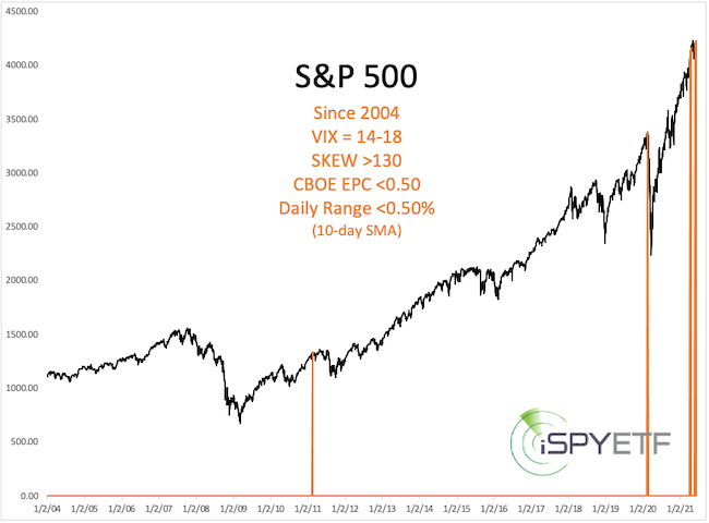
When there's such a small sample size, I always 'widen the net' to 'catch' more precedents. Doing this revealed another common (at least in the past) outcome (discussed in last night's Profit Radar Report).
From a charting point of view, the S&P 500 is trying to break above 4,250, which can be used as line in the sand to gauge risk vs reward.
Continued updates, out-of-the box analysis and forward performance based on historic precedents are available via the Continued updates and factual out-of-the box analysis are available via the Profit Radar Report.
The Profit Radar Report comes with a 30-day money back guarantee, but fair warning: 90% of users stay on beyond 30 days.
Barron's rates iSPYETF a "trader with a good track record," and Investor's Business Daily writes "Simon says and the market is playing along."
|