Buy-and hold investors know that the S&P 500 (SNP: ^GSPC) hasn’t gone anywhere since the beginning of 2014. Why and when will this aimless back and forth stop?
Here are four charts that will progressively shed some light on the issue:
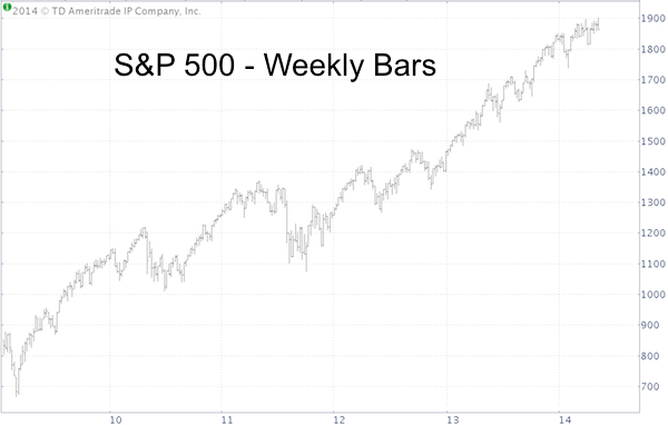
The first chart is a plain weekly S&P 500 bar chart. At the top we see an index that has stalled.
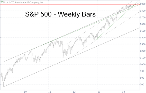
The second chart is the same S&P 500 chart with some simple annotations.
-
Solid black trend channel going back to March 2009
-
Dashed black trend channel going back to October 2011
-
Green support/resistance line going back to April 2010
-
Green support line going back to November 2012
-
Fibonacci projection level going back to 2002
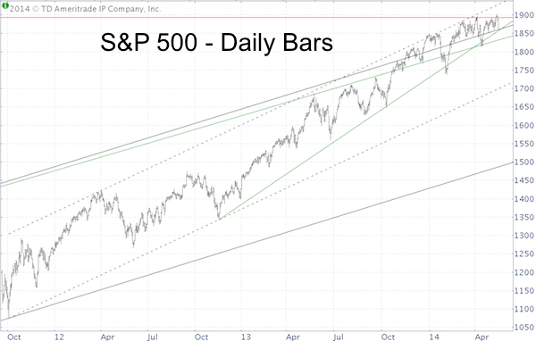
The third chart is a daily bar chart going back to October 2011.
The fourth chart zooms in on the most recent market action in correlation to the various support/resistance (S/R) levels mentioned above.
The blue lines show an S&P 500 that has been boxed in by its own S/R levels.
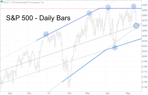
Each blue circle represents a tidbit of ‘insider information’ available to investors familiar with such levels.
S/R conscious investors didn’t chase the S&P 500 when it touched the upper resistance rim and didn’t sell when it touched the lower boundary.
The Profit Radar Report combines those simple S/R levels with technical analysis, seasonality patterns and sentiment analysis.
Here’s an actual recent example of sentiment analysis combined with S/R levels and seasonality:
In the beginning of May, the financial media delivered a wave of bearish headlines, such as:
“Why investors expect to sell in May and go away” – Investors Business Daily
“This Chart Says we’re in for a 20% correction” – CNBC
“I’m worried about a crisis bigger than 2008: Dr Doom” – CNBC
“Risk of 20% correction highest until October” – MarketWatch
Merely based on those headlines, it became clear that the market will shake out premature bears with a drop and pop punch. Via the May 4 Profit Radar Report, I shared this outlook:
“The ‘chart detective’ inside of me favors a shallow dip (1,874 – 1,850) followed by a pop to 1,900 or 1,915 before we see a 10%+ correction. This bold prediction is mainly based on what the ‘chart detective’ thinks will fool the maximum number of investors.”
Resistance at 1,900 was composed of short-term pivots and a long-term Fibonacci projection level. The brief pop above 1,900 no doubt stopped out all the weak bears that followed the media's doom-and gloom talk. Was it enough of a pop?
Thus far the S&P 500 has followed our script, however it continues to trade within the ‘blue box chopping zone’ and above double trend line support.
This week’s high and today’s low are now the new short-term support/resistance box for the S&P 500.
I often get asked: “But what about valuations?”
Do valuations matter? Quite possibly. But how do you determine whether stocks are cheap or expensive? Not even the so-called pros can agree on valuations. Here’s an objective look at three objective valuation metrics and why the pros passionately disagree about valuations.
Are Stocks Cheap or Overpriced? Here's why Analysts Passionately Disagree
Simon Maierhofer is the publisher of the Profit Radar Report. The Profit Radar Report presents complex market analysis (S&P 500, Dow Jones, gold, silver, euro and bonds) in an easy format. Technical analysis, sentiment indicators, seasonal patterns and common sense are all wrapped up into two or more easy-to-read weekly updates. All Profit Radar Report recommendations resulted in a 59.51% net gain in 2013.
Follow Simon on Twitter @ iSPYETF or sign up for the FREE iSPYETF Newsletter to get actionable ETF trade ideas delivered for free.
|