In terms of QE bull market corrections, there are two categories:
Every correction since 2013 has been shallow, usually shedding no more than 5%.
Corrections in 2010, 2011 and 2012 were more complex, losing as much as 20%.
The chart below, which plots the S&P 500 against the percentage of NYSE stocks above the 50-day SMA, illustrates the difference between pre and post 2013 nicely.
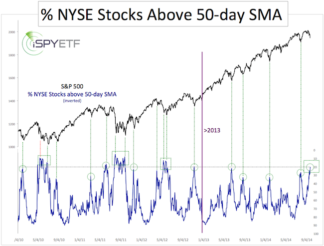
Post 2013 corrections were swift, V-shaped affairs. Every time the % of NYSE stocks dropped to 25-30, the market bottomed. Easy. There was little else to it (see green circles).
The biggest 2010, 2011 and 2012 corrections were more complicated than just simple V-shapes.
One common pre 2013 feature was some sort of a double bottom. As the dashed green boxes highlight, each pre 2013 bottom occurred against a bullish 50-SMA divergence, where the S&P 500 (NYSEArca: SPY) made a new low, but the % of stocks below the 50-day SMA did not.
The Big Question
The big question is if the current correction will follow the pre or post 2013 pattern.
If it follows the pre 2013 pattern, there will be another leg down accompanied by a bullish 50-day SMA divergence.
Complex Analysis Made Easy - Sign Up for the FREE iSPYETF E-Newsletter
If it follows the post 2013 pattern, the correction may already be over.
Even the pre 2013 patterns saw a bounce after the initial 50-day SMA low, so a bounce from current levels is likely.
The chart above doesn’t answer if this correction is already over, but two other indicators provide some clues.
Based on the VIX, this may turn into a more complex correction. More details here: Calm VIX Suggests Elevated Downside Risk for Stocks.
However, to trigger more downside, the Dow Jones needs to drop below this key support. More details here: Dow Jones Pulls Back after Completing Bearish Wedge.
A detailed forecast for October - based on investor sentiment, seasonality and technical analysis – is available to subscribers of the Profit Radar Report.
Simon Maierhofer is the publisher of the Profit Radar Report. The Profit Radar Report presents complex market analysis (S&P 500, Dow Jones, gold, silver, euro and bonds) in an easy format. Technical analysis, sentiment indicators, seasonal patterns and common sense are all wrapped up into two or more easy-to-read weekly updates. All Profit Radar Report recommendations resulted in a 59.51% net gain in 2013.
Follow Simon on Twitter @ iSPYETF or sign up for the FREE iSPYETF Newsletter to get actionable ETF trade ideas delivered for free.
|