QE1 ended on March 31, 2010. Shortly thereafter the S&P 500 dropped as much as 17.12%.
QE2 ended on June 20, 2011. Shortly thereafter the S&P 500 dropped as much as 20.76%.
Fed officials are expected to end asset purchases (QE3 and QE4) at the next FOMC meeting on October 28-29. Will stocks crater like they did in 2010 and 2011?
QE History & Comparison
QE1 started in December 2008 with $660 billion, was expanded by $1,050 billion in March 2009, and ended in March 2010.
QE2’s $600 billion asset purchase injection started in November 2010 and lasted until June 2011.
QE3 started in September 2012 at a rate of $40 billion per month.
QE4 started in December 2012 at a rate of $45 billion per month.
Complex Analysis Made Easy - Sign Up for the FREE iSPYETF E-Newsletter
Starting in January 2014, QE3 and QE4 have been reduced gradually by $5 billion per month.
QE3 and QE4 have already been wound down to combined monthly purchases of $15 billion, and Fed officials said they expect to end asset purchases after the October 28-29 meeting.
Will the QE3 and QE4 withdrawal shock the system (aka stock market) as QE1 and QE2 did?
QE After Shock?
I’m a visual person and find that a picture (or chart) really says more than a thousand words.
Here is a simple, visual explanation of the various QE programs. This is the only QE history chart on the web, and was originally published in the October 5 Profit Radar Report. QE1, QE2, QE3 and QE4 are illustrated by various shades of green, because green is the color of money (chart courtesy of the Profit Radar Report).
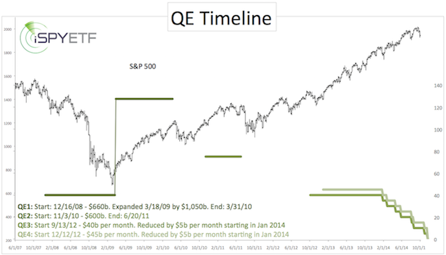
Illustrated are the monthly dollar purchases. Exact monthly asset purchase data for QE1 and QE2 is not readily available, so the amounts shown are based on total committed funds divided by the number of months the program was in effect.
QE3 and QE4 differ from QE1 and QE2 and two important ways:
1) The asset purchases under QE1 and QE2 were more significant than the asset purchases under QE3 and QE4.
2) QE1 and QE2 stopped cold turkey. The Federal Reserve obviously learned from the almost instant S&P 500 (NYSEArca: SPY) selloffs and equipped QE3 and QE4 with the ‘taper’.
Purely theoretical, the actual end of QE3 and QE4 could be a non-event, and should be much less noticeable than the end of QE1 and QE2.
Why Did the S&P 500 Just Lose 200 Points?
But, if that’s the case, why did the S&P 500 just lose as much as 200 points?
Investors may have simply sold stocks in anticipation of QE ending. Sometimes it's all about mind of matter. If investors mind (that QE is ending) it matters, at least temporarily. In addition, the Dow Jones reached an important technical resistance level on September 17. The Profit Radar Report predicted that this resistance level would increase the risk of a correction.
It is undeniable that the various QE programs have driven asset prices higher. It would be intuitive to conclude that the absence of QE (at least sterilized QE) will send stocks lower.
But the stock market is not always intuitive and doesn’t conform to investors’ expectations.
Furthermore, despite the end of QE, the stock market has not yet displayed the classic pattern of a major market top, the kind of pattern that foreshadowed the 1987, 2000 and 2007 highs. Here’s what I mean: The Missing Ingredient for a Major Bull Market Top
In summary, I wouldn’t sell stocks just because QE is ending.
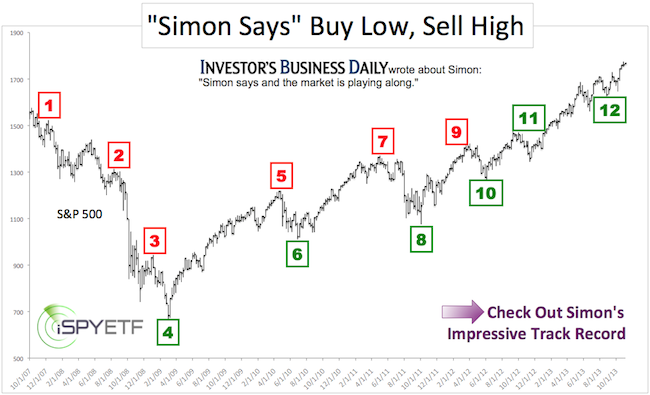
Simon Maierhofer is the publisher of the Profit Radar Report. The Profit Radar Report presents complex market analysis (S&P 500, Dow Jones, gold, silver, euro and bonds) in an easy format. Technical analysis, sentiment indicators, seasonal patterns and common sense are all wrapped up into two or more easy-to-read weekly updates. All Profit Radar Report recommendations resulted in a 59.51% net gain in 2013.
Follow Simon on Twitter @ iSPYETF or sign up for the FREE iSPYETF Newsletter to get actionable ETF trade ideas delivered for free.
|