When it comes to VIX instruments, the S&P 500 VIX (Chicago Options: ^VIX) gets all the attention, while the Nasdaq-100 VIX (Chicago Options: ^VXN) is treated like the ugly duckling.
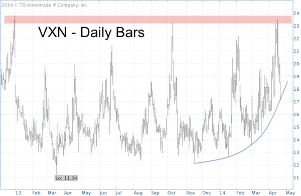
Right now the ‘ugly duckling’ VXN chart looks more interesting than the S&P 500 (NYSEArca: SPY) VIX.
-
Since mid-November VXN has been in a steady up trend.
-
Since the beginning of the year, VXN is climbing along bowl or saucer-shaped support.
-
Resistance at 22-24 has capped every VXN rally.
-
From November – March the VXN has rallied alongside the Nasdaq-100 (Nasdaq: QQQ).
In the technical analysis universe, the bowl-shaped support is quite rare and the actual support level is harder to pinpoint than straight trend line support.
Nevertheless, I’ve seen three asset classes ‘climb up the saucer’ before and tumble thereafter. Silver in April 2011, gold in September 2011, and Apple in April 2012 (see chart below).
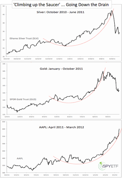
Gold, silver and Apple climbed up the saucer during the late stages of a bull market frenzy. VXN’s rally has been short and comparatively tame, therefore VXN’s reaction to a saucer breakdown may be much more subdued.
This is one of those formations that doesn't jibe with the majority of my indicators right now. Most of my indicators are suggesting that risk is rising. The Nasdaq for example may be crafting the right shoulder of a bearish head-and shoulders formation, but a VXN break down would translate into a higher Nasdaq.
Datapoints like this remind us to never be complacent. On April 14, when the S&P was at 1,820, I wrote an article titled "This Might be the Only Bullish S&P 500 Chart Right Now," and we now know that this chart prevailed over many bearish indicators.
There's another data point that drastically minimizes the odds of an imminent major market top.
Bi-Polar Investors Dump Stocks on Fear of Bull Market End
Simon Maierhofer is the publisher of the Profit Radar Report. The Profit Radar Report presents complex market analysis (S&P 500, Dow Jones, gold, silver, euro and bonds) in an easy format. Technical analysis, sentiment indicators, seasonal patterns and common sense are all wrapped up into two or more easy-to-read weekly updates. All Profit Radar Report recommendations resulted in a 59.51% net gain in 2013.
Follow Simon on Twitter @ iSPYETF or sign up for the FREE iSPYETF Newsletter to get actionable ETF trade ideas delivered for free.
|